Women in Product · CMU
Brand identity, social, and a website for WiP at CMU
As Director of Publicity I created the org's visual identity, ran social media and campus marketing, and built a temporary website — with a logo designed so anyone interested in product feels welcome.
The brief for the logo was inclusivity. That meant not defaulting to the visual shorthand that most women-in-tech organizations reach for: no pink, no single silhouette that reads as one kind of person. The goal was a mark that anyone interested in product could see themselves in.
The result is a circular badge with a rounded "WiP" ligature at the center and "Carnegie Mellon · Women in Product" around the edge. The palette is a deep purple (#574F7D) with a soft off-white, chosen to feel considered without being gendered. Type is Poppins for headings and Hanuman for body, both rounded and approachable.
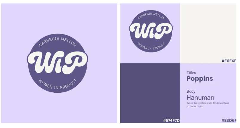
the rounded letterforms in 'WiP' were the main constraint. it had to feel warm, not corporate.
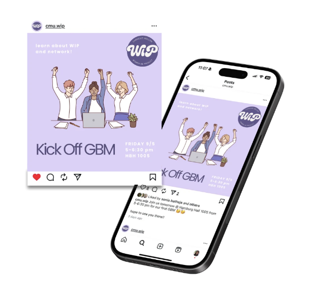
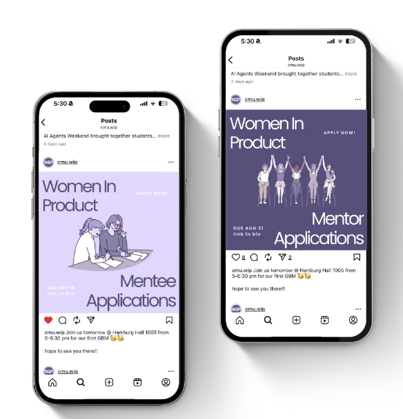
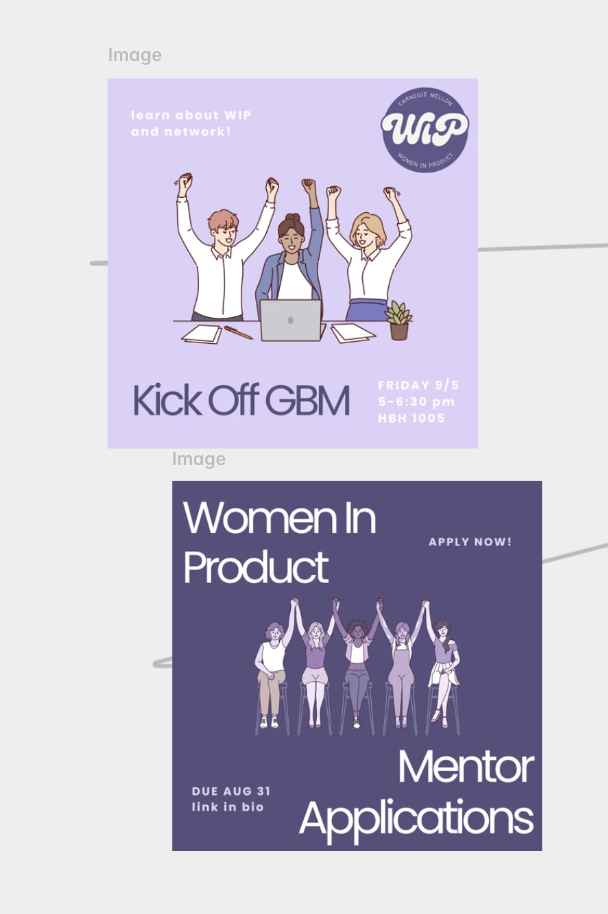
Beyond the identity, I ran the org's social media and on-campus marketing for the year: event graphics, tabling materials, and flyers for every speaker event and workshop. The temporary website gave the org a home online before a permanent one was built.