Biomotivate
Biomotivate
I was hired to fix the interface of a VR therapy platform at an addiction recovery house. The real problem was that patients had stopped finding anything in it worth watching.
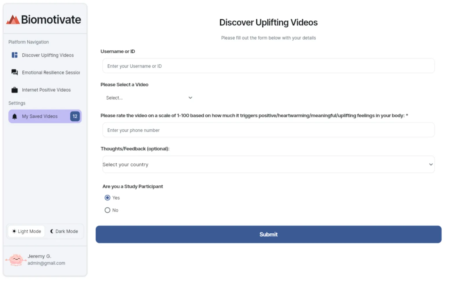
Peace is a VR therapy platform made by Biomotivate, a Pittsburgh startup. At an addiction recovery house, patients used it as part of their routine: put on an Oculus headset and watch a short video that pairs a hard memory with something uplifting. Some of them had been doing this for over a year.
My job was the interface, but the team was also tracking a number that wasn't on my ticket: attendance had been falling since before I got there.
So I went where the patients were. I ran VR sessions myself and sat through about 20 think-alouds, watching people use Peace while they talked me through it.
Nobody struggled with the headset or the app: the long-time patients moved through it without a second thought. What they did instead was search, scrolling for a video they hadn't seen yet. Each session offered one required video and two optional ones, and almost nobody touched the optional ones.
If the videos helped, why skip them? If the app was easy, why stop coming? Were they bored with therapy itself?
They weren't lost in the app. They were tired of what was in it.
That was my hunch. Before betting on it, I lined up every explanation I could think of for the drop.
The headset and the interface couldn't explain why the people who knew them best were leaving. The flyers could explain the method, but understanding why something works isn't the same as wanting to do it. [TODO: confirm once the flyer outcome is in.] The content fit everything: the same library, watched for months, made for no one in particular.
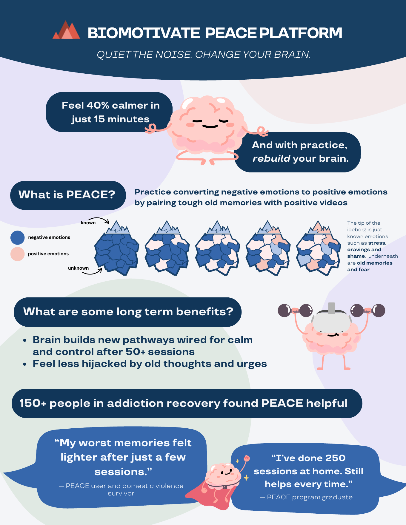
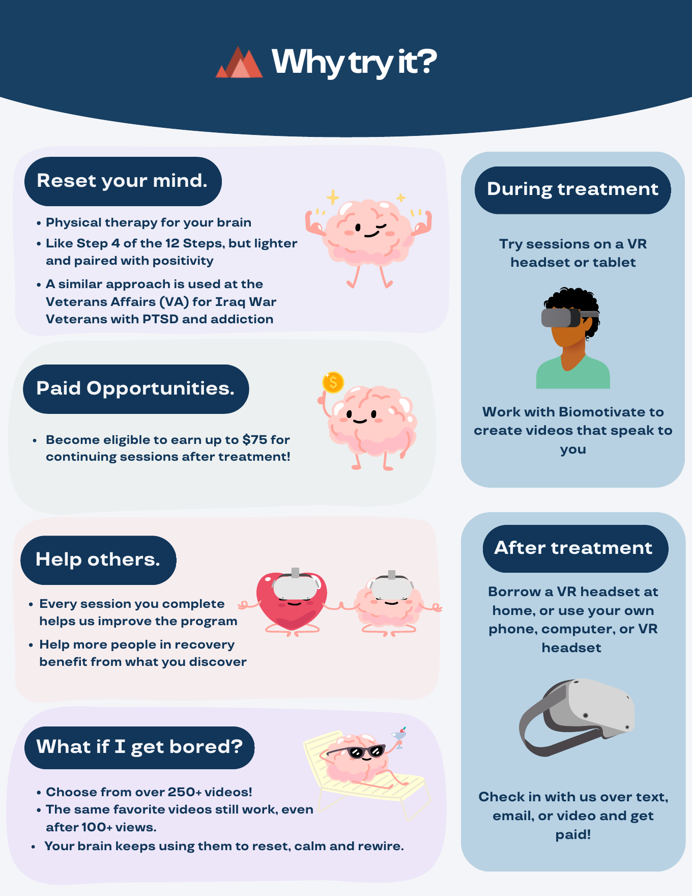
The team's first idea was more videos on more topics. But by our own flyer, the library already had 250+ videos, and people were still scrolling past them.
The first personalized videos got rewatched. People asked to watch them in their free time and came back with ideas for more. The founder pushed back hard: personal videos are slow to make, they don't scale, you can't show one to anyone else, and they raise the privacy stakes. I brought the usability testing results and made the case for long-term value. [TODO: one line, in my voice, on how that conversation went]
“I felt bad for not watching it, because you made it for me.”
Personal videos need personal input, and asking people in recovery about their memories is delicate. An open-ended form (what interests you? what do you want to see?) felt intimidating.
So the form became a short set of guided questions for people who aren't sure what to say. It asks for a good memory, or an interest they'd like to see. I wrote it with the psychology postdoc on our team, who reviewed every question so none of them would lead someone back to their addiction or trauma.
Personal also meant new ways to get it wrong. Characters changed from one clip to the next. Some ChatGPT-generated clips sexualized female characters, and one got a patient's body type wrong. When the video is about your own memory, that isn't a small bug.
So I set a standard for every video:
- One tool and one fixed prompt template, picked after benchmarking the options.
- Prompts written to keep characters consistent from clip to clip.
- A ChatGPT Project with our guidelines and an explicit list of what not to generate.
- A person reviews every generated image before a patient sees it.
Veo and Sora were out: too expensive, too slow, and not close enough to the story.
And the UI fixes I was hired for? I still did them, as part of a rebuild. Our only engineer worked offsite in JavaScript, and the personalized flow was a lot of new work. I proposed moving Peace to FlutterFlow, a free drag-and-drop builder, so I could build the fixes and the new flow myself.


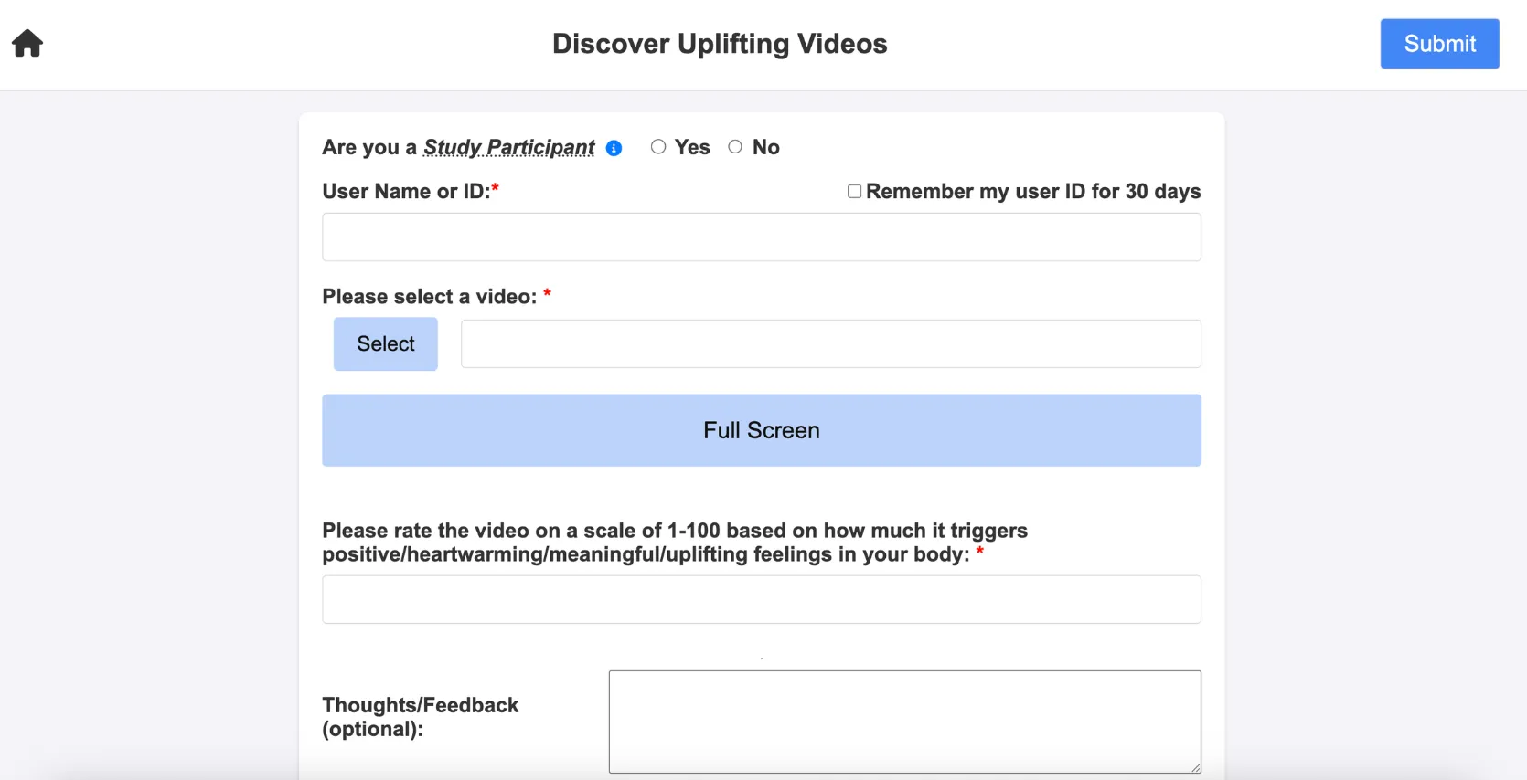
the navigation sidebar was the whole fix. one decision, four destinations.
engagement: more sessions and more repeat views
patients signing up for the first time
Baseline and time window: [TODO]
The full feature was never going to be finished in my three months, and I knew that going in. I left the team with a working flow, a standard for making the videos, and early evidence that personal works better than more.
Pick the problem that matters over the deliverable that's safe, even if you won't be there to see it finished.